
Sidebar Redesign
Roles & Responsibilities
Role - Lead Product Designer
Scope of work - User research, competitive analysis, information architecture, wireframing, prototyping, UI design, design system alignment.
Problem Statement –
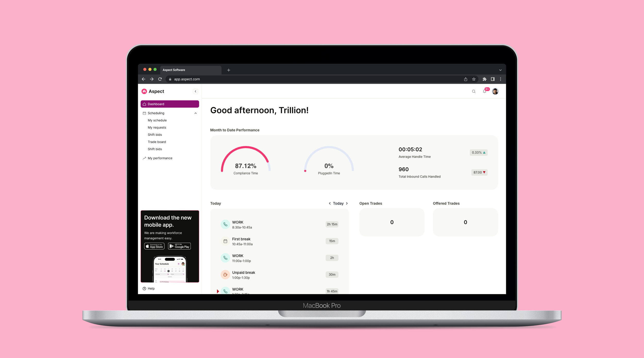
The app's original navigation lived in a floating action bar fixed to the top of the screen. While it kept navigation accessible, it created persistent tension with the content below — overlapping key UI elements, interrupting scroll behavior, and making the layout feel cluttered as the product matured. The floating pattern that once felt lightweight had become a liability.
My goal was to rethink navigation from the ground up — moving away from the floating bar and toward a collapsible sidebar that integrates cleanly into the layout, scales with the product, and gives users control over how much space navigation takes up at any given moment.
Discovery –
The discovery phase started with understanding why the floating action bar had stopped working. Through session recordings and user interviews, a clear pattern emerged — users were frequently scrolling past the bar, accidentally triggering it, or losing track of it entirely when deep in content-heavy views. It wasn't an obvious failure; it was a slow erosion of usability as the app grew around a navigation pattern that hadn't scaled with it.
We also conducted a competitive analysis across tools like Notion, Linear, and Figma to understand how leading products handle persistent navigation — what patterns users have come to expect, how sidebar collapse is communicated, and how navigation state is preserved across sessions.
Discovery –
The shift from a floating bar to a collapsible sidebar wasn't just a layout change — it was a fundamental rethink of how navigation should coexist with content.
The redesign moved navigation off the floating layer and into a fixed sidebar anchored to the left of the screen. A persistent collapse toggle at the top gives users direct control over their layout — reducing the sidebar to an icon-only rail when space is needed, and expanding it fully when context matters. An edge handle in the collapsed state offers a low-friction re-entry point without requiring users to hunt for a button.
Crucially, collapse state is persisted per session — so the app remembers the layout each user prefers, eliminating the repetitive setup that plagued the floating bar experience.
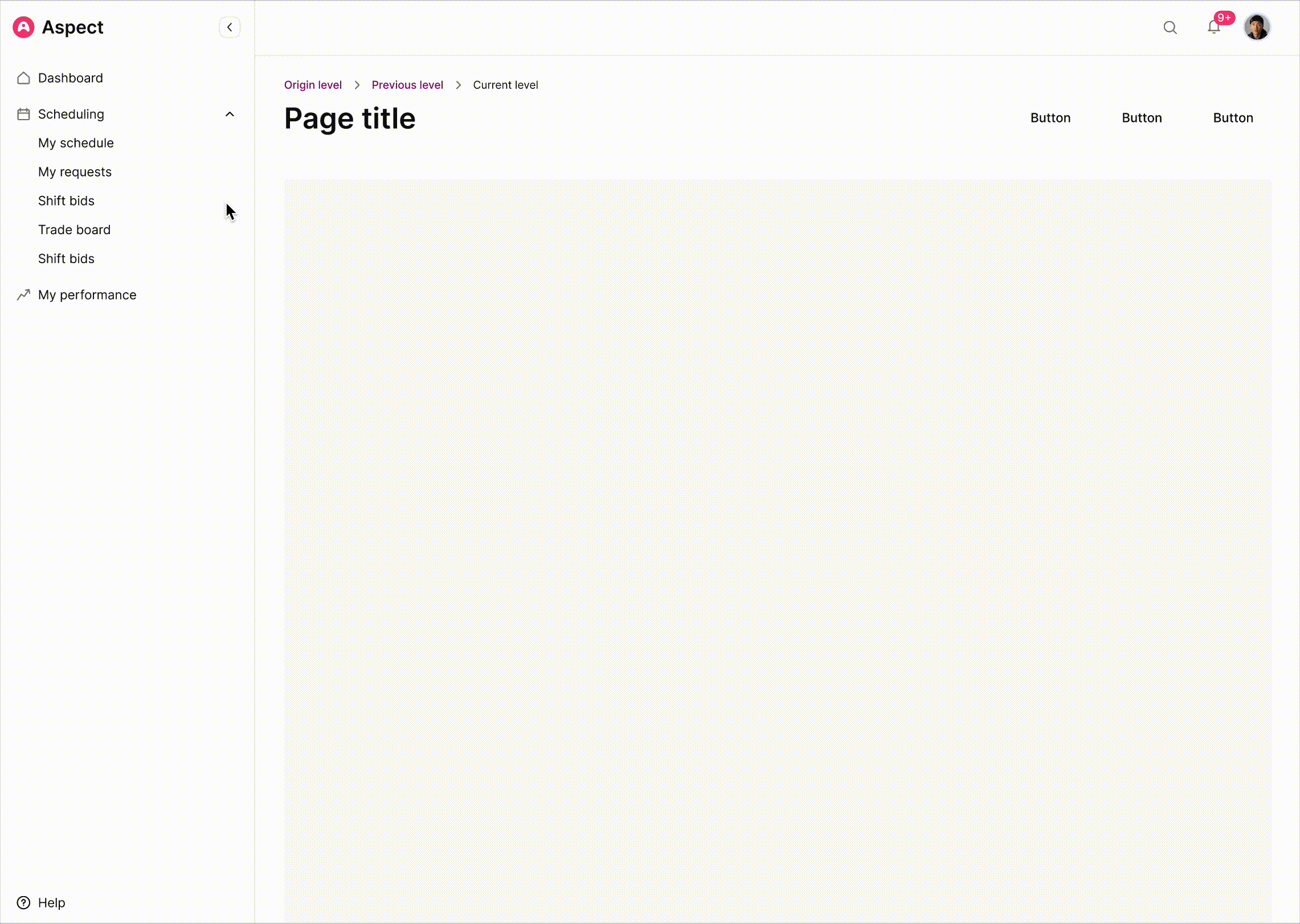
Expanded Sidebar
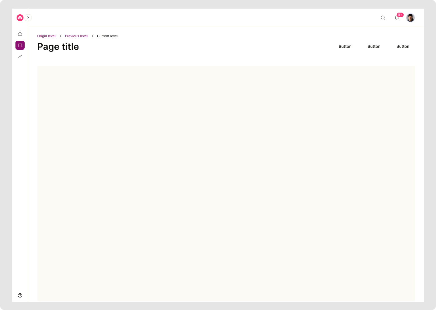
Collapsed sidebar
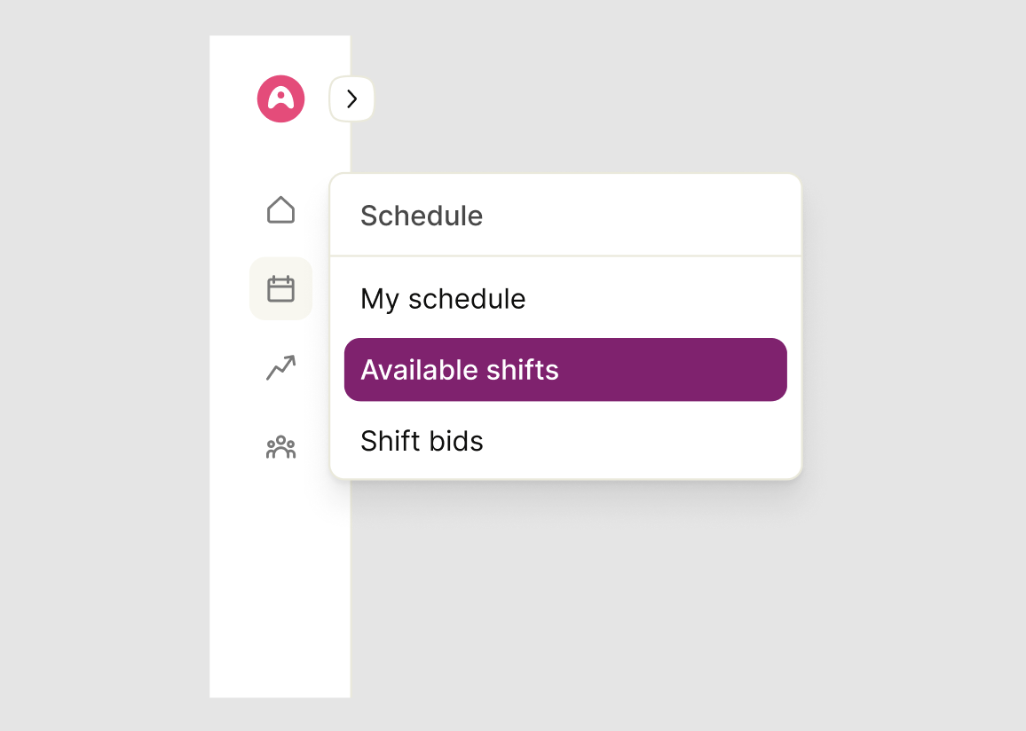
Flyout menu on hover
Prototyping –
A clickable prototype was built early to validate the collapse interaction before investing in high-fidelity design. The prototype focused specifically on the trigger mechanics — where users expected to click, how the transition felt, and whether the icon rail was sufficient for navigation in the collapsed state.
Stakeholder walkthroughs with PMs and engineering surfaced early feasibility questions around animation performance and state management. These conversations shaped the handoff spec and helped us align on interaction behavior before a single line of production code was written.
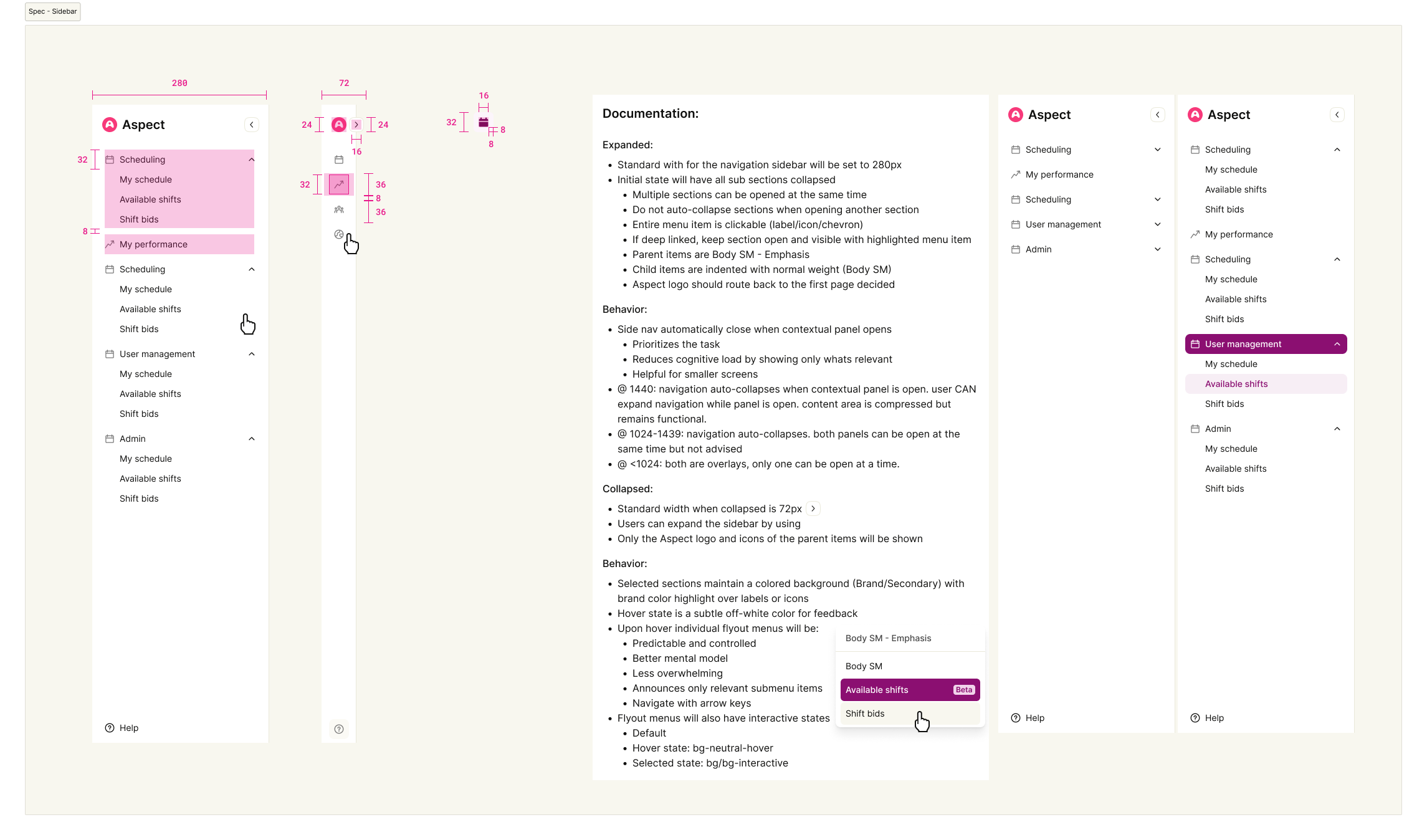
Anatomy and documentation of the sidebar
Refine –
Testing surfaced a few friction points worth addressing. Some users missed the collapse toggle on first scan — leading us to increase its visual weight and add a subtle tooltip on hover. Others found the transition jarring at the default duration, which we smoothed out through easing adjustments validated in a follow-up round.
We also iterated on the collapsed icon rail itself — early versions relied on icons alone, which caused confusion for less-familiar users. Adding tooltips on hover resolved this without breaking the minimal aesthetic of the collapsed state.
Impact –
Moving from a floating action bar to a collapsible sidebar resolved the core tension users had been experiencing — navigation no longer competed with content for space. The collapse feature saw strong adoption post-launch, and users consistently noted feeling more in control of their workspace layout.
The icon rail approach proved especially effective in the collapsed state, preserving navigational awareness without the visual noise of the original floating bar. The design also leaned heavily on the existing design system — reusing tokens, motion values, and component patterns — keeping the build lightweight and the experience consistent with the broader product.